


Well, having used it for years, I can say this is the first I’ve realised what the image on the Lyle’s Golden Syrup is – and little too late as it’s now being dropped. For those who didn’t realise as well, these iconic golden syrup tins had the image of a dead lion being swarmed by bees – my mind had been blown!
The firm has now rebranded their products with a lion’s head and single bee instead. Although, the iconic Lyle’s Golden Syrup tin will be excluded from the rebrand and will keep it’s 150-year-old packaging. The rebrand will just be on the firm’s syrup and dessert bottles.
In an aim to appeal to modern shoppers, the simpler design has been applied. The original logo is the world’s oldest unchanged brand packaging – even holding the Guinness World Record remaining unchanged since 1888, according to the brand.
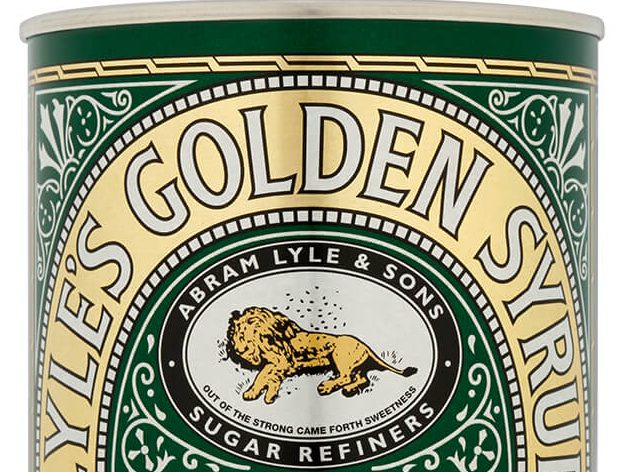
First introduced by Scottish businessman Abram Lyle, the Victoria-style tins have religious imagery due to Lyle’s strong beliefs. The logo depicts the story of Samson from the Old Testament, in which he killed an attacking lion – later noticing a swarm of bees forming a honeycomb on the carcass.
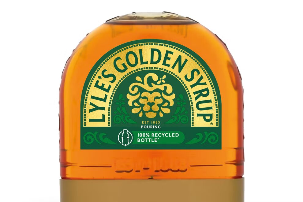
The new packaging will begin to be seen in shops this month and continue throughout the year across full-sized bottles, breakfast bottles, dessert toppings and golden syrup portions, according to Lyle’s Golden Syrup said.
The company’s brand director James Whiteley “Our fresh, contemporary design brings Lyle’s into the modern day, appealing to the everyday British household while still feeling nostalgic and authentically Lyle’s.”
Read More:
Feature Image Credit: Tate & Lyle Sugars


